Exploring a media campaign focused on pet owners through user research
Summary
Insights from physiological-based usability studies facilitate user experience strategy development
Invisible Fence Brand, established in 1973, pioneered the world’s first electronic pet containment system. The company has since remained an industry leader, continuously innovating and developing advanced technologies to ensure pet safety. The agency team responded to a request for proposal, aiming to develop a digital media campaign for Invisible Fence Brand.
As the user experience designer for the request for proposal, my role involved understanding user interactions within the “Save $150” campaign landing page and collecting corresponding qualitative data. This landing page integrated directly into the main Invisible Fence Brand website.
This process involved recruiting participants, setting up and calibrating research lab tools, collecting data, and then analyzing and synthesizing the results. The project took shape and finished in January 2017.
Role | Evaluative research, Presentation preparation
Timeline | January 2017
Collaborated with | Agency management
Project team members | Al Moffatt (Project Lead), Sonia Brisson-Smith (Project Management)
Project goals
The Invisible Fence Brand digital campaign embedded a promotional campaign landing page within the primary website. This landing page contained product messaging, showcased a promotional component with the headline “Save $150 On an Installed Outdoor Solution,” and offered a form for scheduling no-obligation, in-home consultations. In addition, the landing page featured an accordion component for frequently asked questions and a content section for more calls to action.
In this context, users had the opportunity to interact with other product pages on the website. To ensure the attainability of project goals, the project employed the SMART acronym, which stands for Specific, Measurable, Achievable, Relevant, and Time-bound.
Goal one | Investigate the connection between user attention and task completion time within the website.
Goal two | Determine the relationship between users' focus on navigation elements and the time taken to complete tasks.
Goal three | Identify the correlation between users' attention on product content and the overall time taken to complete tasks.
Each of these goals measured a different aspect of user behavior and interaction on the campaign landing page. The goals helped to develop a holistic understanding of how different elements affect user behavior and task efficiency.
Study
Introduction
With the study’s goals in mind, the recruitment process focused on internal agency stakeholders exclusively. The project involved creating a simulated environment enabling participants to test interactions with the Invisible Fence landing page and understand the interconnectedness of the various pages.
Ten participants took part in the usability study for this research. Of these, eight belonged to the 35 to 55 age group, one to the 18-24 age group, and one was 65 or older. Additionally, the participant pool included seven males and three females.
The study asked participants to complete nine tasks involving the Invisible Fence landing page. Task presentation took the form of scenarios, designed to mimic situations potential site stakeholders might encounter. The phrasing of the task scenarios received careful attention to avoid accidentally steering participants towards the task’s expected outcome.
After concluding the eye-tracking segment of the study, participants engaged in a semi-structured discussion. This conversation probed various facets of the participants’ experiences, encompassing their overall impressions of the site, the ease of navigation, along with any perceived challenges and benefits.
Participants also identified the most and least challenging tasks, suggested improvements, and expressed likes and dislikes about the site. Additionally, participants discussed potential user challenges based on different demographics, proposed additional features, and had the opportunity to voice any other comments or concerns.
Task one | Find dog safety content
In the first task of the Invisible Fence Brand study, participants received the prompt, “Your main concern is whether this product is safe for your dog. Where would you look?”
Participants interacted with various elements across the “Save $150” campaign landing page and the “How it works” page. Out of ten participants, seven completed the first task successfully. The time spent on the task ranged from a minimum of 18 seconds to a maximum of 139 seconds. This placed the average at 66 seconds and the median at 48 seconds.
Key observations from the task suggested potential enhancements for the Invisible Fence Brand’s campaign user experience. Considerations included presenting all solutions offered by the brand on the landing page, integrating social and video content to address safety concerns, and questioning whether the accordion structure for FAQs limited content discovery. Other points of focus were effectively leveraging facts and figures for trust-building, introducing a “share this page” feature to bolster brand awareness, and using more imagery to connect with users.
Task one | Save $150 landing page
Study participants navigated to the “Save $150” campaign landing page during the study. Participant visual attention predominantly concentrated on the primary navigation and crucial content areas of the landing page. This behavior marked initial interactions with the website.
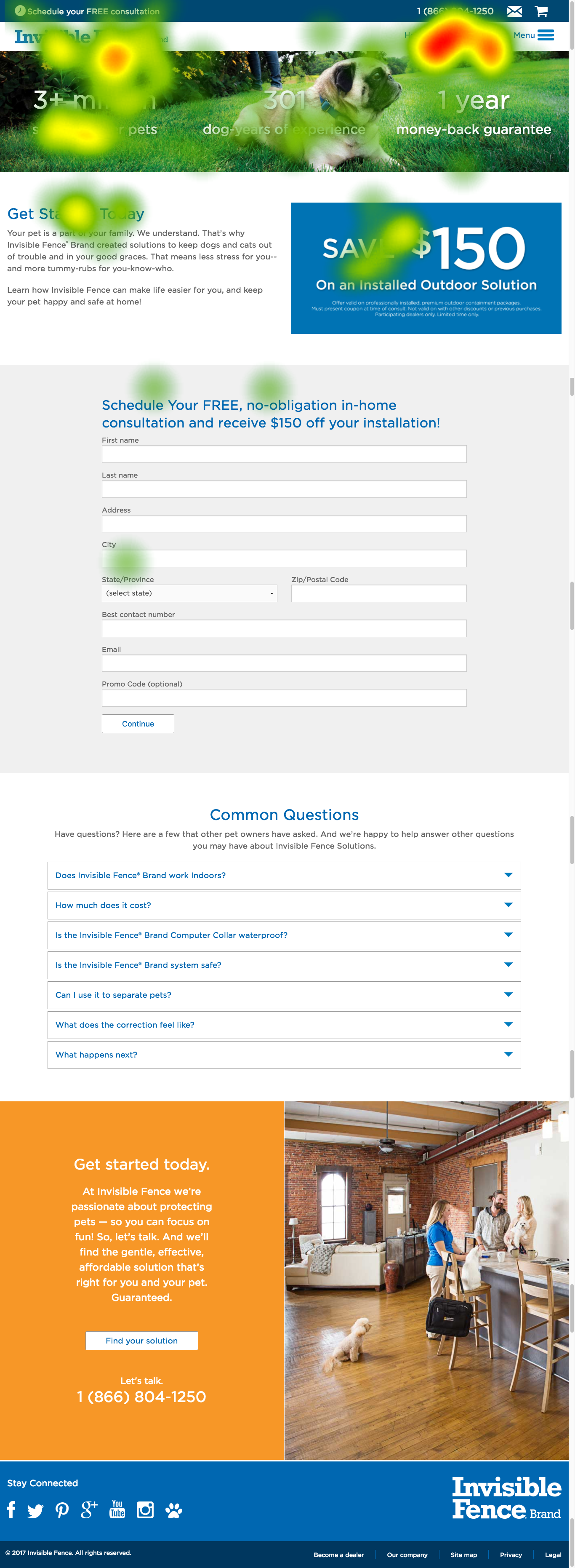
The primary navigation elements, such as “How it works” and “Pricing,” garnered the most visual attention. The Invisible Fence Brand logo and the “3+ million safer, happier pets” also received attention Notable headlines such as “Get Started Today” and “Save $150” attracted attention as well. Conversely, the form on the landing page drew minimal focus relative to the task. For this task, it’s notable that the “Menu” link, along with its associated iconography, did not draw attention relative to the task’s requirements from the participant pool.
View the full version of the Save $150 landing Page heatmap →
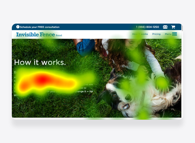
Task one | How it works page
Participants next interacted with the “How it works” primary navigation link. The varied content structure of this page led to a range of browsing patterns. Most visual attention focused on a paragraph related to the task. The “How it works” page demonstrated the crucial role of visual trustworthiness, placing emphasis on relatability and empathy. This was evident when a participant remarked that the website was “pretty with all the dogs,” a sentiment reflected effectively by the primary image on the page.

This page also showcased the importance of content hierarchy and image composition. As participants scanned the content, a spotted pattern of browsing emerged. Headlines and the initial words of associated paragraphs often drew visual focus. Content relevant to the task received significant visual attention. Notably, the FAQ titled ‘Will it work on my pet? Big, little, young, and old’ within the accordion content component attracted considerable attention.
View the full version of the How it works page heatmap →
Task two | Find product information
In the second task of the Invisible Fence Brand study, participants received the prompt, “Another question is whether the product functions as intended. Where would you look?”
Participants navigated across several pages of the “Save $150” campaign landing including and the “How it works” page, the “FAQs” page, and the “Solutions” page. Participants interacted with the side-drawer navigation. Out of ten participants, eight completed the second task successfully. The time spent on the task ranged from a minimum of 23 seconds to a maximum of 94 seconds. This placed the average at 57 seconds and the median at 63 seconds.
Key observations from the task illuminated areas for consideration in enhancing the user experience on the Invisible Fence Brand’s campaign landing page. Drawing data from various customer support channels emerged as a potential strategy in creating a more data-driven FAQ list. The emphasis on safety and ease of use was particularly significant to the study participants. This, along with product demonstrations, warrants further consideration. Also, the performance of the side-drawer navigation, whether positioned on the right or left side of the screen, was another element taken into account.
Task two | Save $150 landing page
During the study, participants further explored the “Save $150” campaign landing page. As they crafted a cognitive map of this digital experience, their visual attention predominantly sketched a spotted browsing pattern. In search of information pertinent to the task, attention centered on the accordion content component containing the FAQs. Participants interacted with all elements featured in the primary navigation, demonstrating significant visual interest in the “How it works” link.
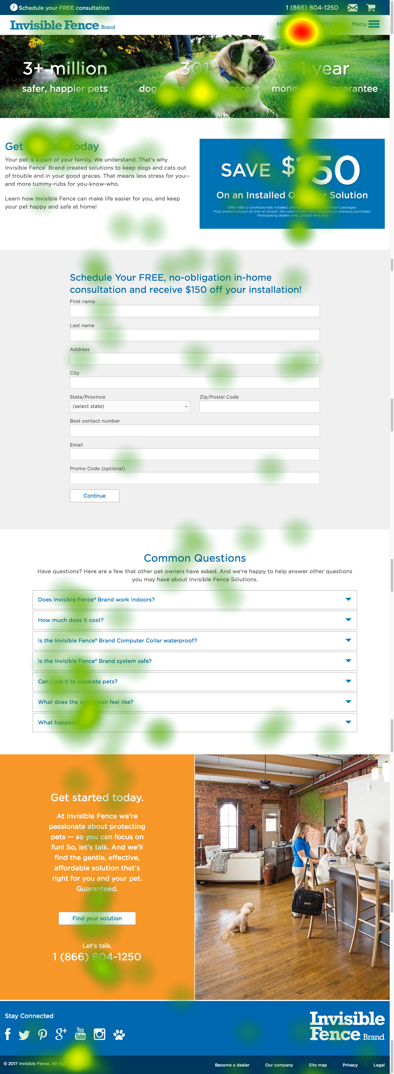
In relation to the task, participants also expressed visual interest in various content sections of the “Save $150” campaign landing page. Notable among these were the “301 dog-years of experience” section, the headline “Get Started Today,” the “Find your solution” button, and the service’s telephone number.
View the full version of the save $150 landing page heatmap →
Task two | Save $150 landing page menu
During the second task, participants engaged with the side-drawer navigation for the first time. This vertical navigation, located on the right side of the screen, contained top-tier items. Task participants visually scanned and interacted with these vertical elements.
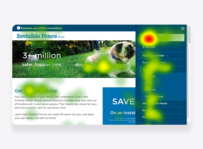
Participants directed their visual attention to the “Solutions” link primarily. This action expanded the link to display all available solutions, including “Indoor,” “Outdoor,” “Pet Door,” and “Total Solutions.” The study identified a potential for a card sort exercise to yield insights about this product group and the rest of the navigation structure. Participants gave equal visual attention to the “Blog” and “FAQ” navigation links.
Task two | FAQs
In this task, a participant navigated to the FAQs page using the side-drawer navigation. The page heatmap revealed a distinct scan path, with the participant’s focus initially converging on the centered headlines, then shifting to the left-aligned frequently asked questions housed within an accordion content component.
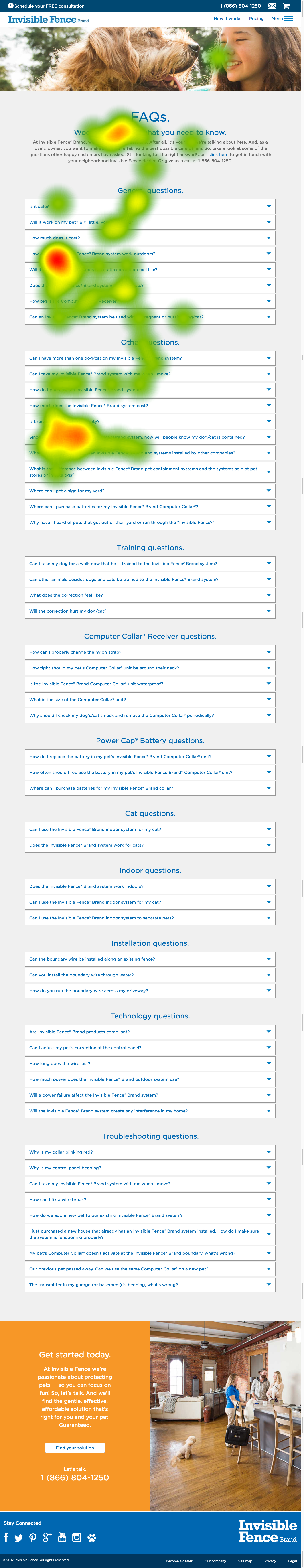
The task-driven activity led the participant to focus on the questions “How does the Invisible Fence Brand system work outdoors?” and “Since you can’t see the Invisible Fence Brand system, how will people know my dog/cat is contained?”. Overall, participants expressed that the FAQs provided comprehensive information, distinguishing them from the more high-level content dispersed across the rest of the site.
View the full version of the FAQS page heatmap →
Task two | Solutions page
One participant visited the “Solutions” page. Their scan patterns implied expectations of finding task-related information there. After reviewing the content, they proceeded to the “How it Works” page. This navigation pattern highlighted potential content overlap between the two pages, emphasizing the need for distinctive information architecture.
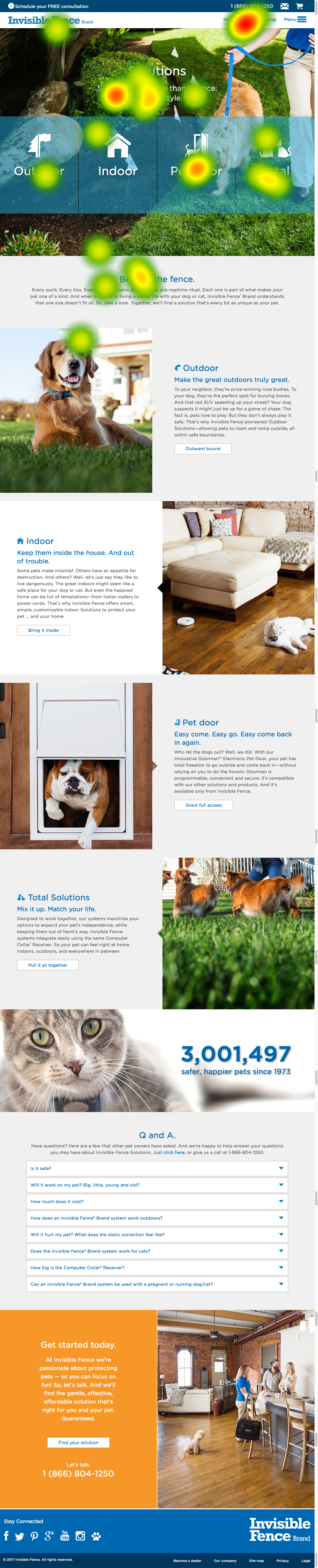
Furthermore, this pathway demonstrated the influence of nomenclature within the campaign experience. It provoked a key question about the interplay between the “Solutions” and “How it Works” pages. These findings indicate that overlapping or unclear content across these pages might heighten users’ cognitive load, emphasizing the importance of an intuitive, well-structured site design for effortless navigation and comprehension.
View the full version of the Solutions page heatmap →
Task two | How it works page
During the task, participants opted to visit the “How it works” page via the primary navigation. The heatmap of the task showed a scan pattern similar to that observed in the first task, illustrating a scanning path across the page. Participants directed their attention towards content relevant to the task, including the main paragraph, the “Computer Collar Receiver,” and the “Why does it work so well?” sections.
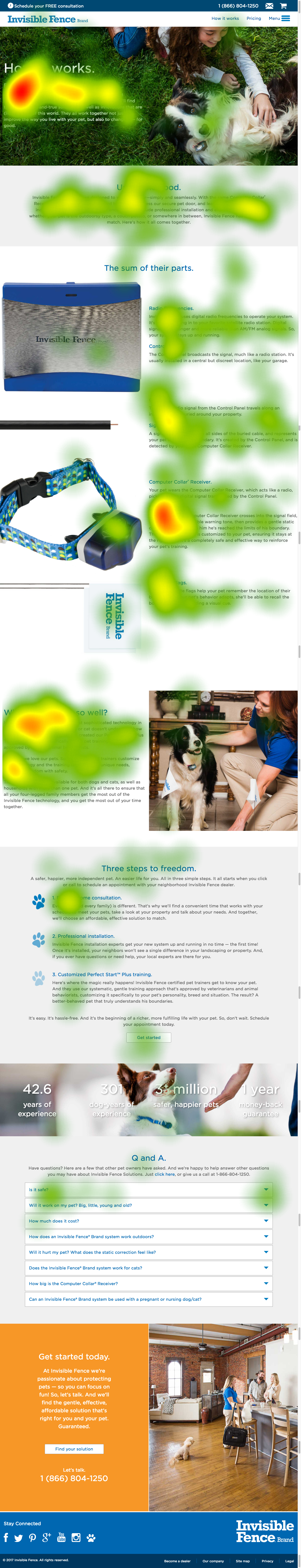
The post-study conversations revealed participants’ interest in various content sources. A focus on an omnichannel approach, encompassing social platforms, training websites, and third-party pages, emerged as key areas for further exploration and integration. They expressed a desire for greater emphasis on safety and ease of use. This preference, particularly shown through their interest in product demonstrations, underscored a leaning towards direct, demonstrative content regarding product operation.
View the full version of the How it works page heatmap →
Task three | Pricing
In the third task of the Invisible Fence Brand study, participants received the prompt, “You were wondering about the costs. Where would you look?”
Participants navigated to the “Pricing” page. All ten participants completed the third task successfully. The time spent on the task ranged from a minimum of 13 seconds to a maximum of 67 seconds. This placed the average at 34 seconds and the median at 25 seconds.
In the study, observations were made regarding the weightage of key terms like “free,” “professional,” “guarantee,” and “no-obligation” when positioning the message. Considerations were given to the potential impact of featuring a section discussing local Invisible Fence Brand dealers in the conversion funnel. Additionally, an analysis of user viewing patterns provided insights into the opportunity to optimize the positioning of “Schedule your FREE consultation” to increase interaction.
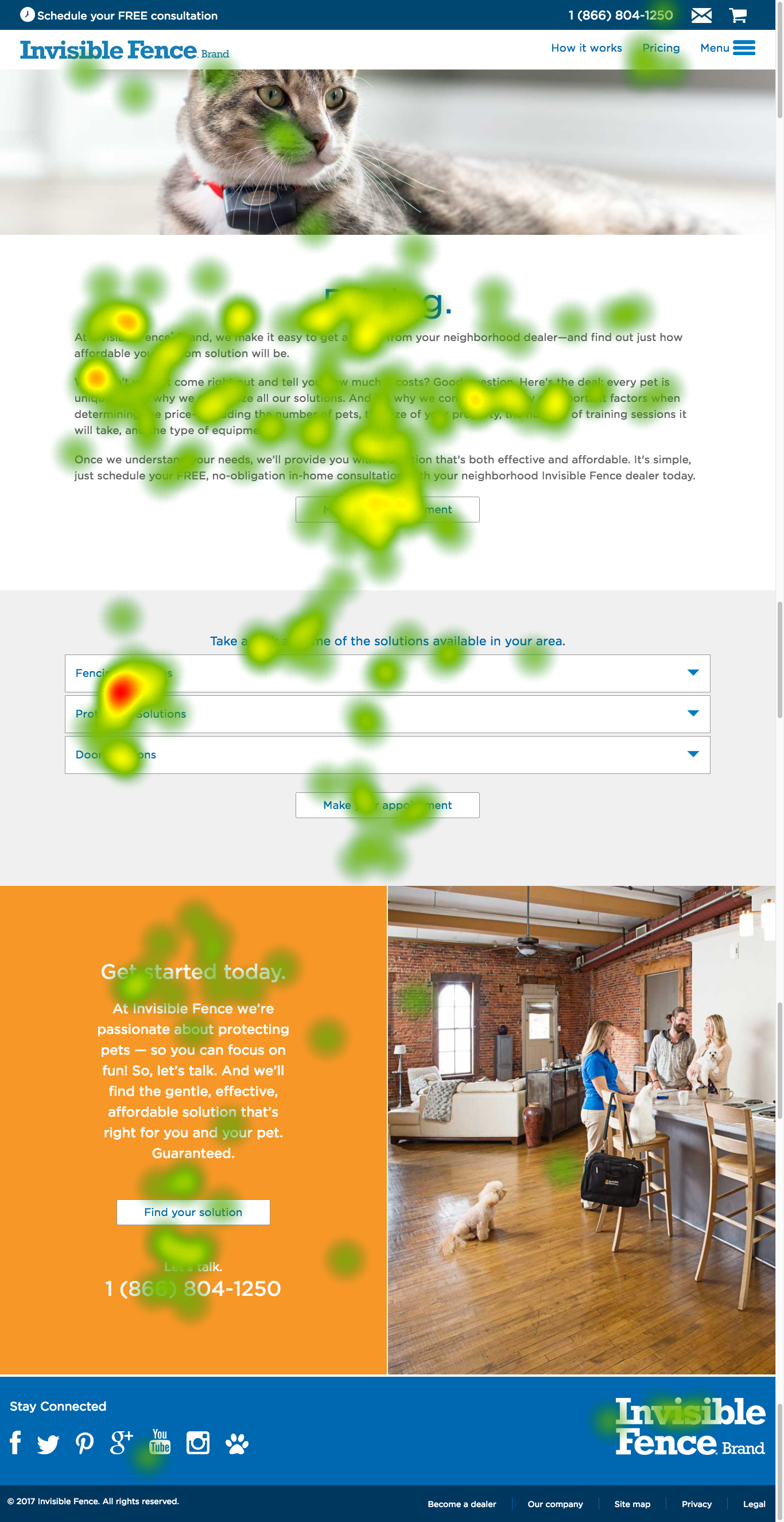
Task three | Save $150 landing page
During the study, participants further explored the “Save $150” campaign landing page. Notably, the “Pricing” link was a focal point of visual attention related to their task. Participants also focused on the “Save $150” content component, the initial words of the headline “Schedule Your Free, no-obligation in-home consultation and receive $150 off your installation!”, and the commonly asked question in the accordion component: “How much does it cost?”
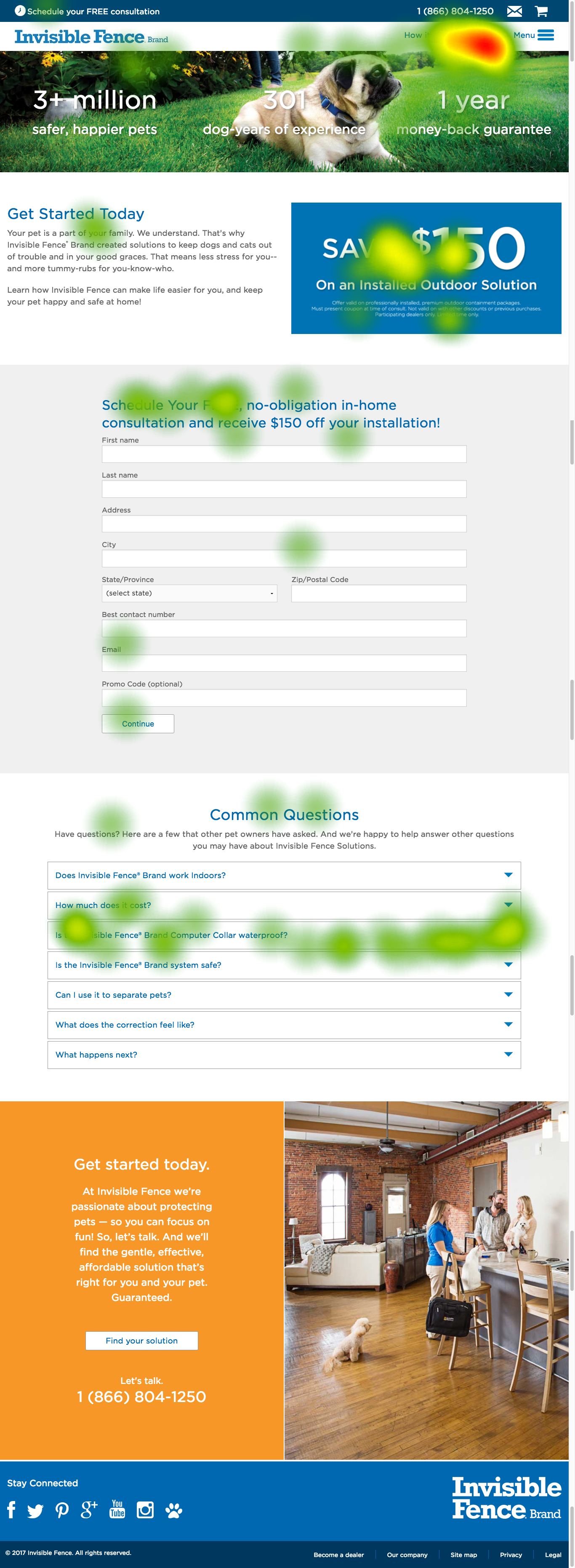
On the campaign landing page, a participant observed that the content component featuring the promotional messaging was not interactive or clickable.
View the full version of the Save $150 landing page heatmap →
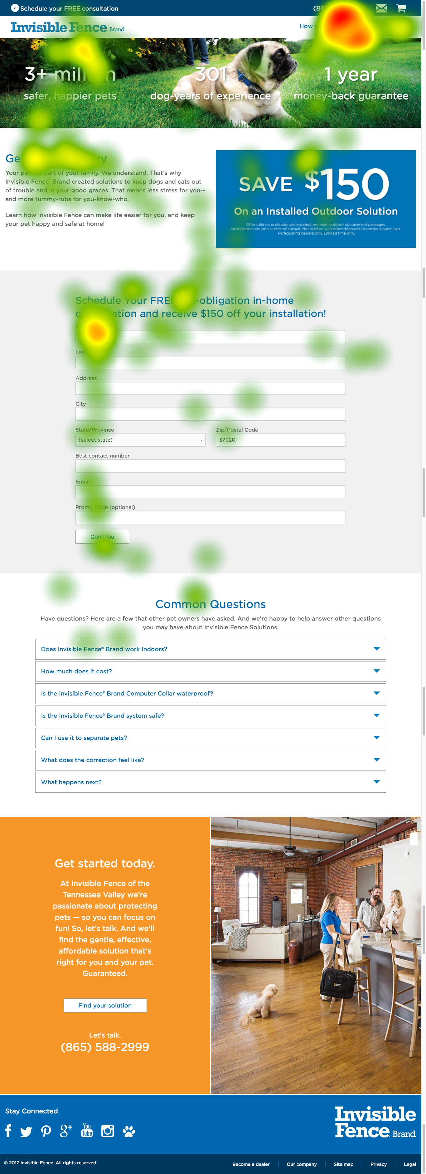
Task three | Pricing page
During the third task, participants navigated to the “Pricing” page, where their visual attention formed a scanning pattern across various content sections in search of pricing information. The “Make an Appointment” button garnered notable attention. Among the content sections, the accordion component with three questions attracted the most visual interest. Subsequent sections of the page, including another “Make an Appointment” button, the “Get started today” headline, the “Find your solution” button, and the “Let’s talk” headline accompanied by a phone number, received some degree of visual attention.
Participants emphasized the need for transparent, accessible, and upfront pricing information across different model lines, along with a breakdown of costs.
Participants also expressed interest in a calculator for expense estimation based on yard size, perimeter, and dog type, and sought ballpark figures due to the absence of pricing details.
View the full version of the Pricing page heatmap →
Task six | Schedule appointment
In the sixth task of the Invisible Fence Brand study, participants received the prompt, “You’d like to set up an appointment for an onsite evaluation of your property and gather additional information. Where would you start?”
Participants navigated to the “Pricing” and interacted with the side-drawer navigation. Of the ten participants, nine participants completed the sixth task successfully. The time spent on the task ranged from a minimum of 9 seconds to a maximum of 37 seconds. This placed the average at 18 seconds and the median at 14 seconds.
Through observation, the study identified a need to realign the envelope icon with a “Contact Us” function. The inclusion of all crucial links in a broadened menu could also enhance content recognition. The study also opened discussions around the possible use of social media channels for customer support. Interestingly, some users showed a preference for making appointments via phone calls.
Task six | Save $150 landing page
As the study progressed to its sixth task, participants familiarized themselves with the structure of the “Save $150” campaign landing page, effectively building a cognitive map. Notably, the “Pricing” link in the primary navigation attracted visual interest. Similarly, the phone number displayed in the secondary navigation drew considerable visual attention.
Participants also visually engaged with the “Menu” link, along with its associated iconography. However, it was surprising to observe that the “Schedule your FREE consultation” headline and the envelope icon in the secondary navigation garnered only minimal visual attention.
View the full version of the Save $150 landing page heatmap →
Task Six | Pricing page
During the sixth task, participants navigated to the “Pricing” page, where their visual attention formed a scanning pattern. The scanning pattern followed the page headline, the beginning of content sections and the call to action on the page.
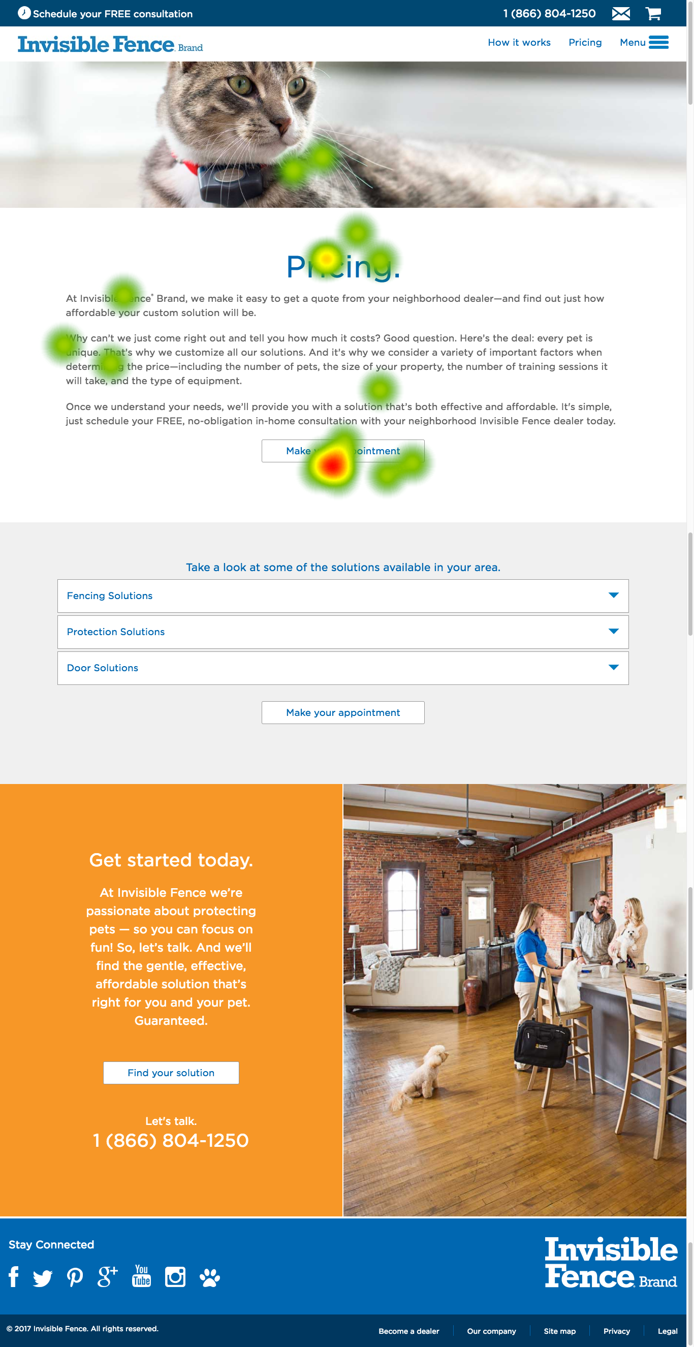
With limited participant interaction, the “Pricing” headline and the “Make an Appointment” button received the most visual attention.
View the full version of the Pricing page heatmap →
Task six | Save $150 landing page menu
A participant also used to side-drawer navigation in the sixth task of making an appointment. In this heatmap the interaction forming a right to left pattern proved interesting.
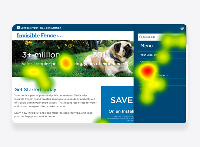
In the side-drawer navigation, visual interest occurred on the “Solutions” link. Visual interest was also given to the “Why Invisible Fence.” link.
Closing thoughts
The study unveiled several key considerations for enhancing user interaction with the Invisible Fence Brand “Save $150” campaign landing page. An important question that emerged was how users might return to the landing page after navigating away. This poses an opportunity to streamline the user journey, potentially by confining the landing page to a single, standalone page rather than integrating it within the broader website.
Participants sought transparency and authenticity. They expected to hear claims about the product being the best, but study discussions revealed a stronger interest in honest reviews and customer feedback. A few participants mentioned resorting to third-party platforms for unbiased opinions. Incorporating more user-generated content and addressing specific issues in a transparent manner could enhance trust and engagement.
Moreover, the study highlighted the potential for crafting an omnichannel experience. A well-designed, cohesive journey between the landing page, social media platforms, training websites, and physical stores could significantly improve user engagement and satisfaction. This unified approach may not only simplify the campaign experience but also ensure that customers consistently receive a seamless and efficient experience, no matter the touchpoint they interact with.
This research played a small part in the request for proposal. After the new business presentation, the feedback described a successful event. If recalled correctly, the digital campaign kicked off but was outside the scope of my role.