Establishing a responsive design system for content compatibility across devices
Summary
Generative research on personalized financial service innovation informs an iterative approach to user experience design
Capital Bank operated as a regional bank with locations in Tennessee, Virginia, North Carolina, South Carolina, and Florida. It offered deposit services, consumer loans, business loans, and other financial services. The agency’s task was to craft a design solution to enhance the customer-centric mission that Capital Bank strove to achieve for its digital experience.
As the user experience designer for this project, I established an understanding of Capital Bank’s operational ecosystem, identified crucial user flows, and created wireframes that integrated key performance indicators and user goals. The primary focus of this case study is the user flow for personal finance service discovery.
This process included gaining an understanding of users through qualitative and quantitative research, implementing proper usability practices, and utilizing an iterative design approach based on feedback from users, project team members, and client stakeholders. The completion of this project occurred between on March 2016 to May 2016.
Role | Generative research, Information architecture, UX design, Evaluative research
Timeline | March 2016 – May 2016
Collaborated with | Account management, Project management, Design, Development, Internal stakeholders
Project team members | Amanda Lewis (Account Executive), Melinda Bowles (Project Manager), Reid Evans (Technical Lead & Back-end Developer), David Furman (Front-end Developer), Jason Reyna (Digital Designer)
Discovery
The Capital Bank digital experience before the redesign consisted of one website. Although the website’s visual design needed enhancement to maximize user engagement, the website’s information architecture was well-structured, facilitating the ease of navigation. The primary navigation contained category pages such as “Personal Banking,” “Business Banking,” “Customer Support,” and “About Capital Bank.” A secondary navigation included “Home,” “Locations,” “Investor Relations,” “Careers” links and the phone number for contacting Capital Bank.
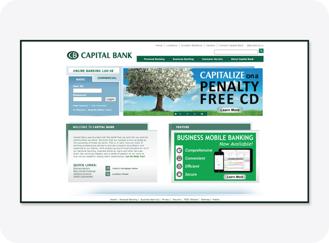
As indicated by the information architecture, each content category catered to a specific user group. Secondary information included service offerings and service-related topics. The design positioned the account access for online banking in a prominent area.
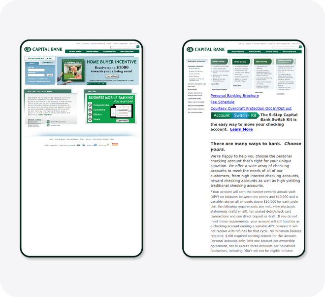
The system adjusted the desktop experience to fit the smaller screen when someone accessed the website from a mobile device. This approach led to a multitude of accessibility issues. The challenges included everything from readability due to small text and poor color contrast, to limited touch target size and complicated navigation.
Gaining insights into users’ practices and the contexts of service usage highlighted the changing trends in technology use. An upward trend in mobile phone ownership and device usage became evident during this project stage.
This change in device usage altered the contexts in which customers utilized the service. Using data collected from secondary research in leading industry publications, an ecosystem analysis offered insights into the integration of financial services into daily life.
Another important element was the relationship between financial services and age of users. Since financial services are often co-created, service offerings adapt and change over time.
Project goals
Since Capital Bank was a part of the financial services industry, market dynamics had an influence on project goals. Utilizing secondary research for leading financial industry publications, and to ensure the attainability of project goals, the project employed the SMART acronym, which stands for Specific, Measurable, Achievable, Relevant, and Time-bound.
Goal one | Develop a mobile-friendly website that offers functionalities relevant to specific user contexts.
Goal two | Implement a design system that's flexible and scalable enough to adapt to new technologies and methods of interaction.
Goal three | Introduce personalized content for the website that enhances user understanding.
The website’s primary key performance indicator, new account creation, influenced content components throughout the site. Together, these goals shaped a comprehensive user experience strategy
Information architecture
Card sorting provided insights for the information architecture of the website. A card sort is a user-centered research method for gathering quantitative data from website users. Card sort data contains insights as to how potential site users group ideas and topics together and what words they use to define their participant-generated groupings. Card sorting is a “bottom-up” approach for studying how users will interact with the basic core components of a website’s information architecture.
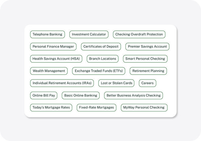
After reviewing and assessing the current Capital Bank website, 40 cards provided representation of all content types. This analysis focused on how the services and account types form relationships to current pages and the organization within groups.
In an open card sort, users name the groups of cards they have created. An open card sort includes between 25 to 50 topics. Adhering to user research data standards for card sorts, 15 participants provided data for card sort assessment and analysis.
To understand how stakeholders categorize banking-related terms, two primary stakeholder groups, employees and bank customers, completed the card sort. In total, 19 participants completed this card sort activity.
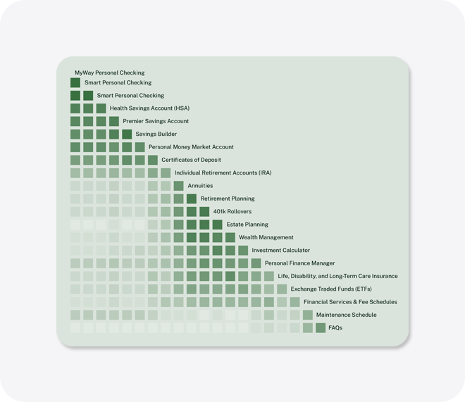
Examining the terms led to standardization for determining the groups and their classifications. Analysis of dendrograms and a similarity matrix unveiled grouping and patterns.
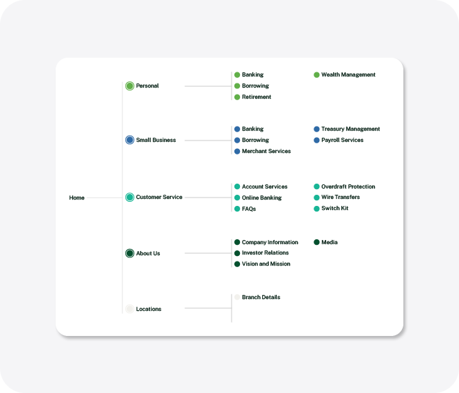
The insights from the card sort resulted in the first iteration of the site map for the Capital Bank website. This site map guided the foundation of the site’s information architecture and assists with the creation and direction of the wireframes.
Design
Iteration one
The first iteration of the Capital Bank website aimed at achieving project goals through meaningful content interactions. Based on the card sort results, the main navigation elements centered on “Personal Banking,” “Business Accounts,” and “Customer Service.” The main navigation also featured “Search” and “Sign In” links.
Each of these categories contained secondary navigation for access to specific content areas. The secondary navigation included service categories such as “Checking,” “Savings,” “Retirement,” “Investments,” “Mortgages,” and “Loans.”
In this iteration, the homepage catered to users interested in personal banking by featuring the secondary navigation. From this navigation, the user had the ability to navigate to the service of interest.
Iteration one | Homepage
For the first iteration of the homepage, the content hierarchy followed the structure of the primary navigation. Customer testimonial components existed between user group content. These elements introduced personalized content for the website that enhances user understanding. Furthermore, the customer testimonial components provided an emotional connection with customers.
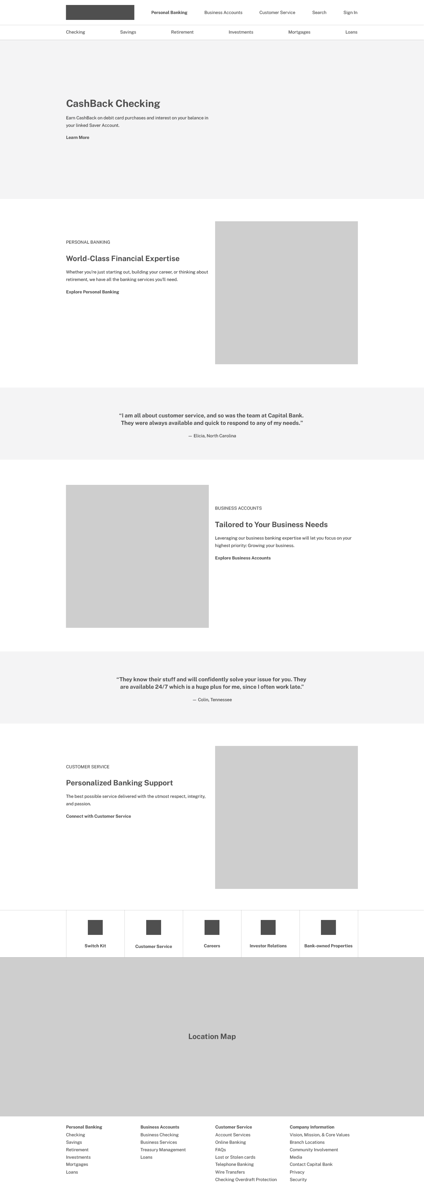
Continuing, a link grouping component contained key actions related to the primary customer journey near the bottom of the page. This included access to the “Switch Kit,” another entry point to the “Customer Service” link. “Careers,” “Investor Relations,” and “Bank-owned Properties” maintained access points relevant to ancillary customer journeys. Beneath this component, a map displayed bank and ATM locations.
View a full size desktop wireframe of the first iteration of the Homepage →
Iteration one | Category page
The first iteration of the category page introduced several components to display information in bite-sized chunks. The page hierarchy followed the secondary navigation which included content components for “Checking,” “Savings,” “Retirement,” “Investments,” “Mortgages,” and “Loans.” The components provided users with control to select individual services within each category.
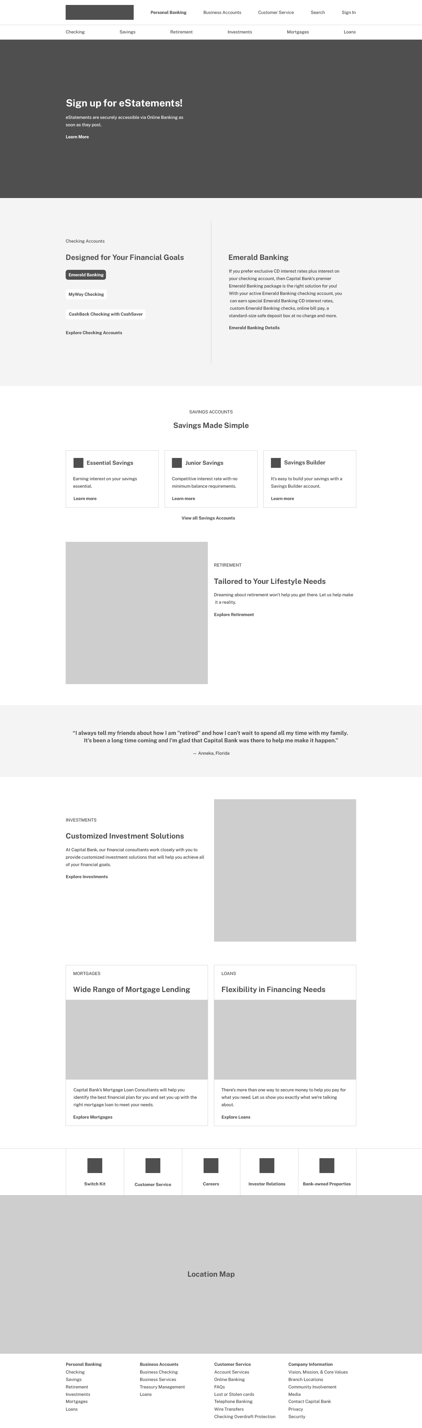
For example, the “Checking Accounts” component provided the user with a summary of individual checking account types with a link to more details. The user could navigate to the service landing page.
Continuing, each content component accommodated mobile-friendly interactions. For example, the “Savings Accounts” module contained three savings account cards that stacked on mobile devices. This pattern occurred with the rest of the components on the page. To build a mental model, the category pages used the same footer hierarchy of service access points and the locations map.
View a full size desktop wireframe of the first iteration of the Category page →
Iteration one | Service page
The first iteration of the service page contained all services in a card-based format. This enabled the user to identify the appropriate service. An iconography system provided key attributes of each service in a glanceable format.
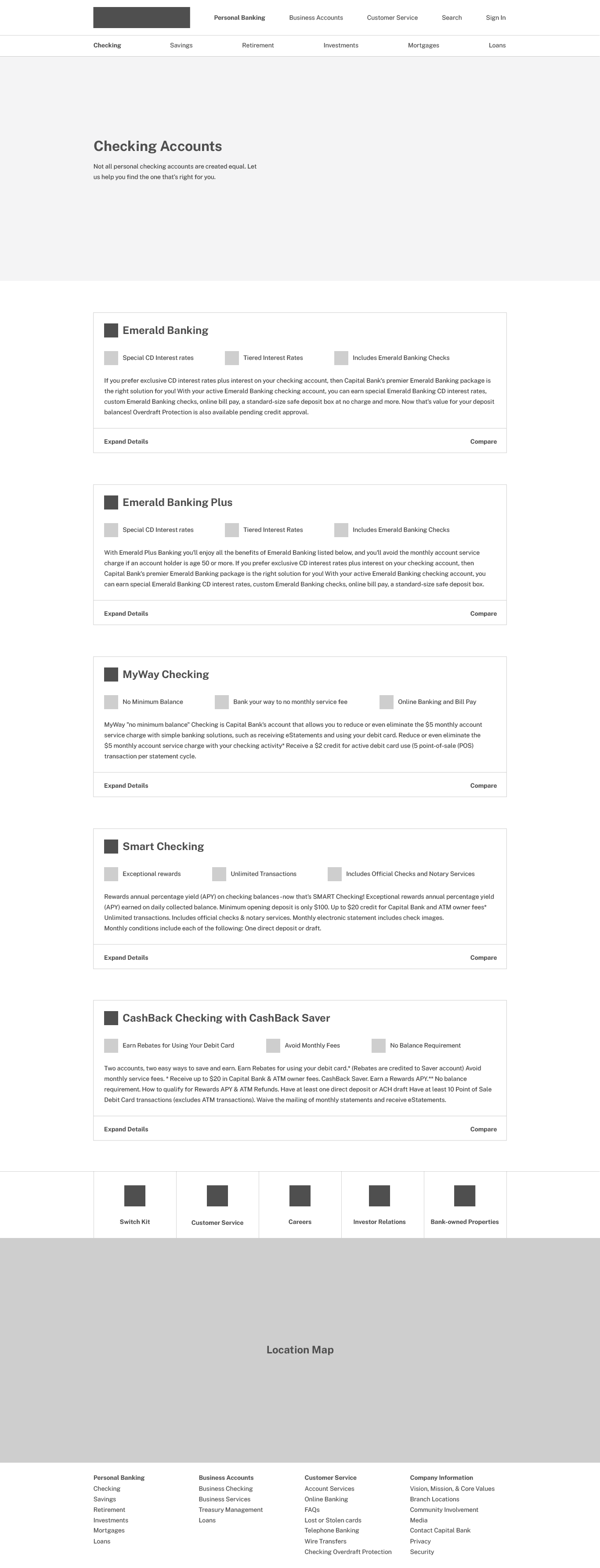
Each card allowed the user to compare different services. An “Expand Details” link displayed the full description of the corresponding service.
View a full page desktop wireframe of the first iteration of the Product page →
Iteration two
The second iteration of the Capital Bank website maintained a focus on achieving design goals within the revised scope of the project.
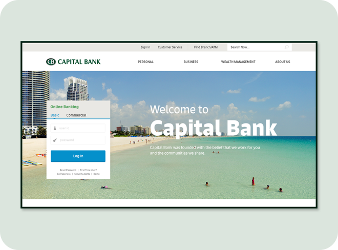
The second iteration introduced an updated “Log In” component, offering users quick access to online banking functions. This iteration of the website shifted its focus towards a set of content cards. These cards not only supported mobile-friendliness but also offered quick, glanceable content.
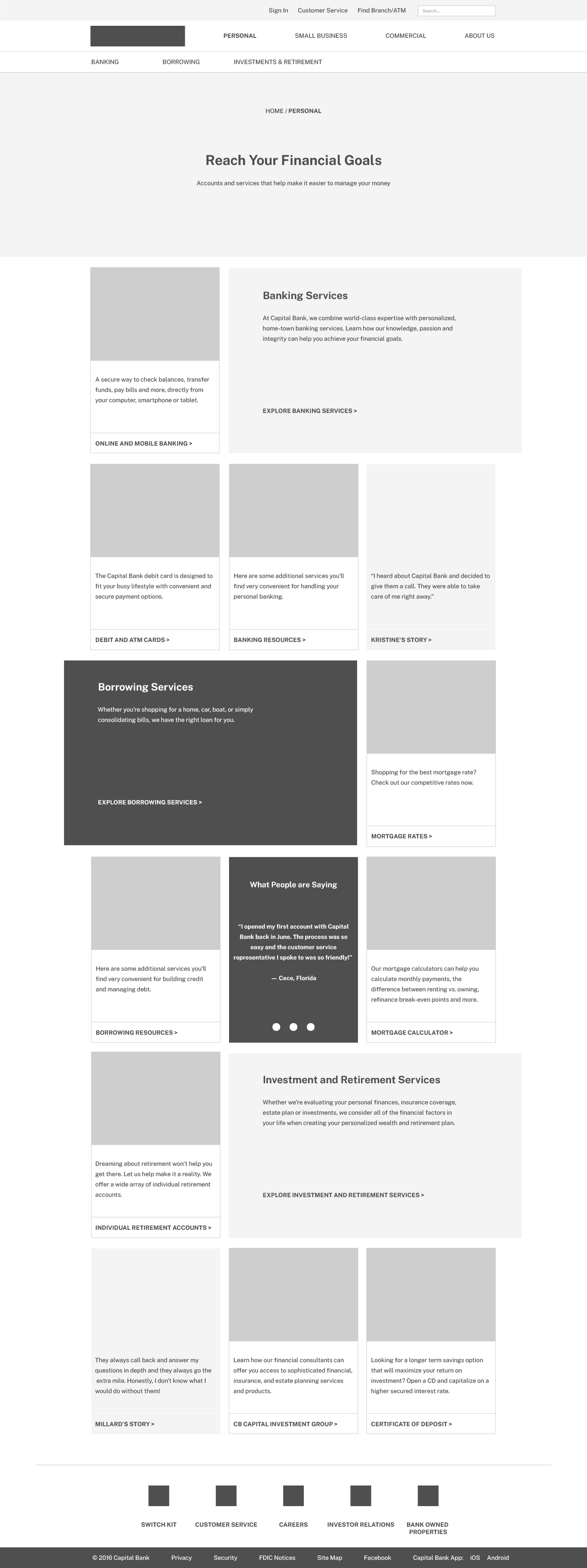
Iteration two | Homepage
In this iteration, the primary navigation contained links such as “Personal,” “Small Business,” “Commercial,” and “About Us”. The secondary navigation featured “Sign In,” “Customer Support,” and “Find Brand/ATM” links, along with a search field. A tertiary menu also existed, housing links to category-specific services like “Banking,” “Borrowing,” and “Investments and Retirement.”
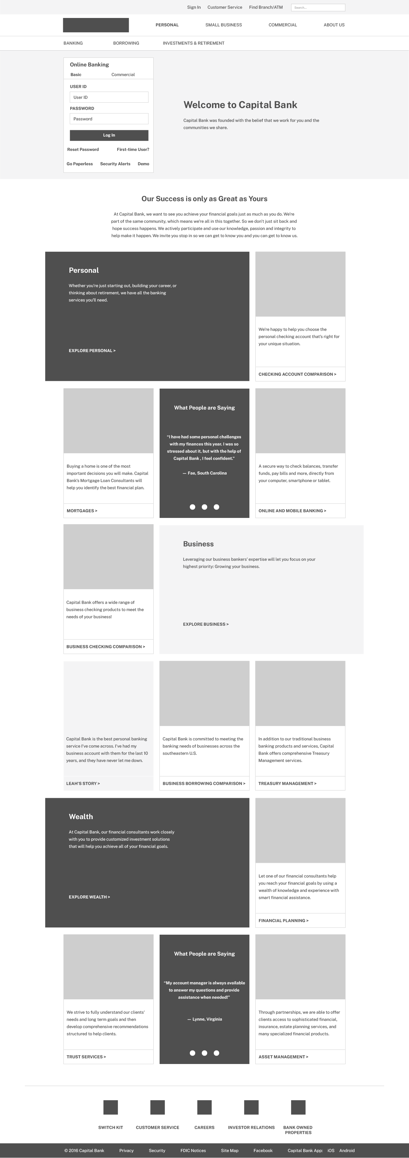
The homepage contained a hierarchy of cards focused on categories. Each group of cards featured corresponding content. For example, the “Personal” card group contained three content cards related to services and a card that contained user testimonials. This iteration of the website included more in-depth user stories related to service offerings.
View a full page desktop wireframe of the second iteration of the Homepage →
Iteration two | Category page
The second iteration of the category page adhered to the established card-based model from the homepage, with each card retaining the same structure but with adjustments to labels and corresponding cards. This approach offered flexibility, allowing for content change based on individual user needs.
View a full page desktop wireframe of the second iteration of the Category page →
The content hierarchy of the category page adhered to the tertiary navigation, which in this example included “Banking,” “Borrowing,” and “Investments & Retirement.” Like the homepage, the card groups on the category page featured content cards that focused on user testimonials and stories.
Iteration two | Service Detail page
In the second iteration, the service detail content card developed into an individual page for each type of service. For instance, in the case of “Emerald Banking,” a full-width content card displayed all pertinent details of the service.
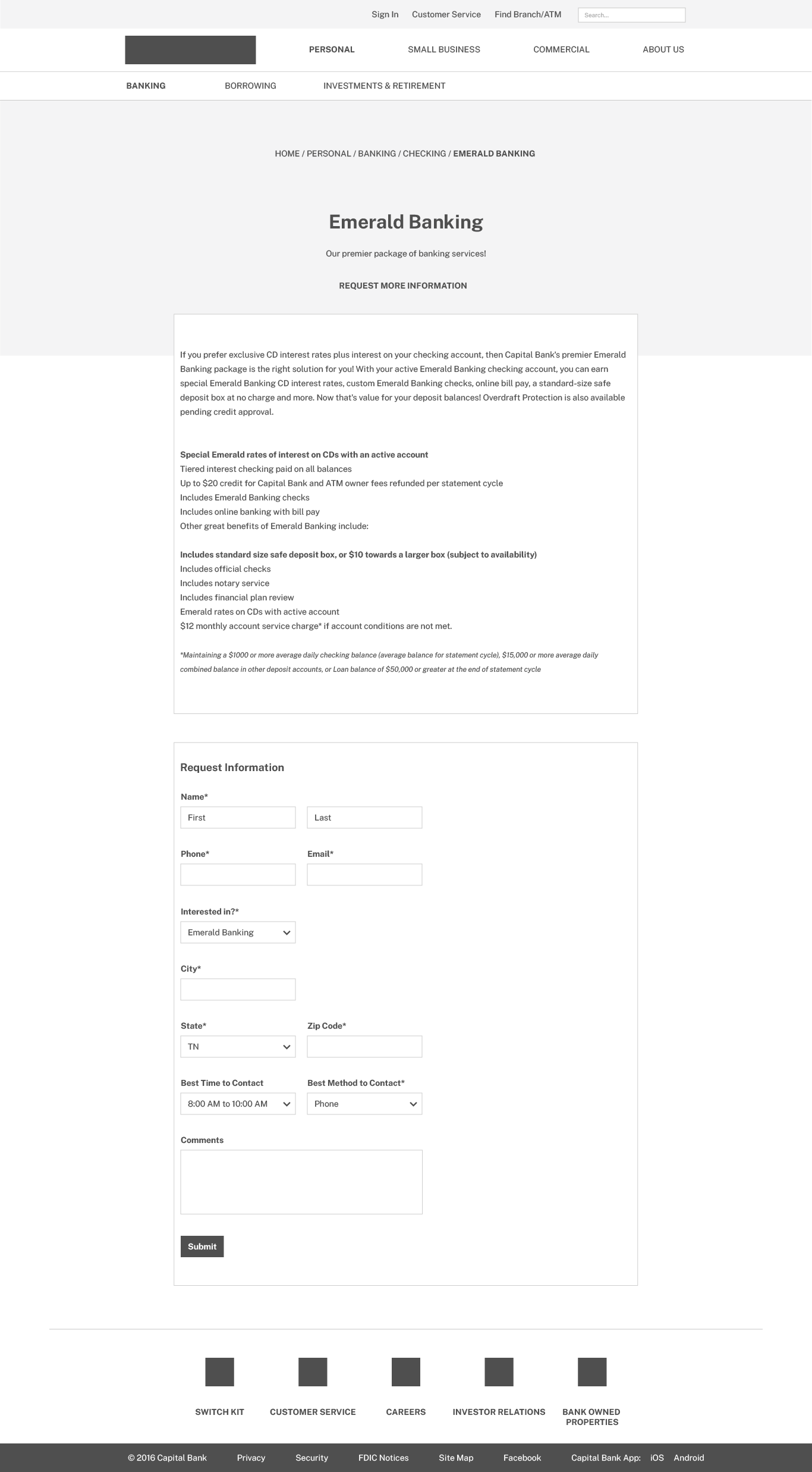
Below the service-related content, there was a form for users to request more information and initiate contact with the bank staff. The “Request More Information” label above the content card functioned as an anchor link, leading users to the form when clicked.
View a full page desktop wireframe of the second iteration of the Service Detail page →
Usability research
Utilizing the Tobii Eye tracking platform, the study involved creating a simulated environment for participants to test interactions between the new Capital Bank designs and explore the relationship between the designed pages. This process yielded meaningful data. An interactive design tool provided the functionality to collect data on user interactions with the site. Participants engaged in completing eight tasks using a prototyping tool that showcased the new Capital Bank designs. All participants fell within the 25-40 age demographic.
The study involved crafting tasks that simulated actions performed by the site’s potential stakeholders and presenting participants with relevant scenarios. The study aimed to find information about a new bank.
Task one | Personal checking: account types
In the first task of the Capital Bank study, participants encountered the following scenario:
“You’ve recently moved to Tennessee and are looking for a local bank to handle your banking needs. A friend recommended Capital Bank. Before you commit or sign up for any accounts, you want more information about their checking services.”
Next, Participants viewed the question, “Where would you go to find more information about the various checking service options?”
The image above illustrates the total eye-tracking fixation data for Task One. The red areas on the heatmap show where participants focused most of their attention. As seen in the heatmap, participants considered each link in the main navigation. Participants interacted with the drop-down navigation.
In the task of locating “personal checking,” all eight participants were successful. The quickest completion of the task took 6 seconds, while the longest took 22 seconds.
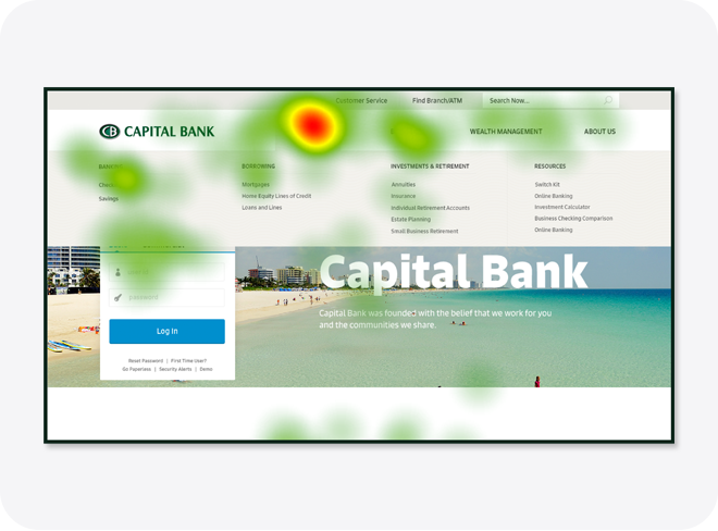
Task two | Personal checking: account creation
In the second task of the Capital Bank study, participants received the prompt, “Now that you’ve read about the checking services, how would you start the process of opening a checking account?”
Given the task completion time and the pass/fail rate, this was the most challenging task for participants. They used various navigational paths, including the main navigation, the homepage, the personal services page, and the personal banking page.
Out of eight participants, only three completed the second task. The time spent on the task ranged from a minimum of 25 seconds to a maximum of 103 seconds.
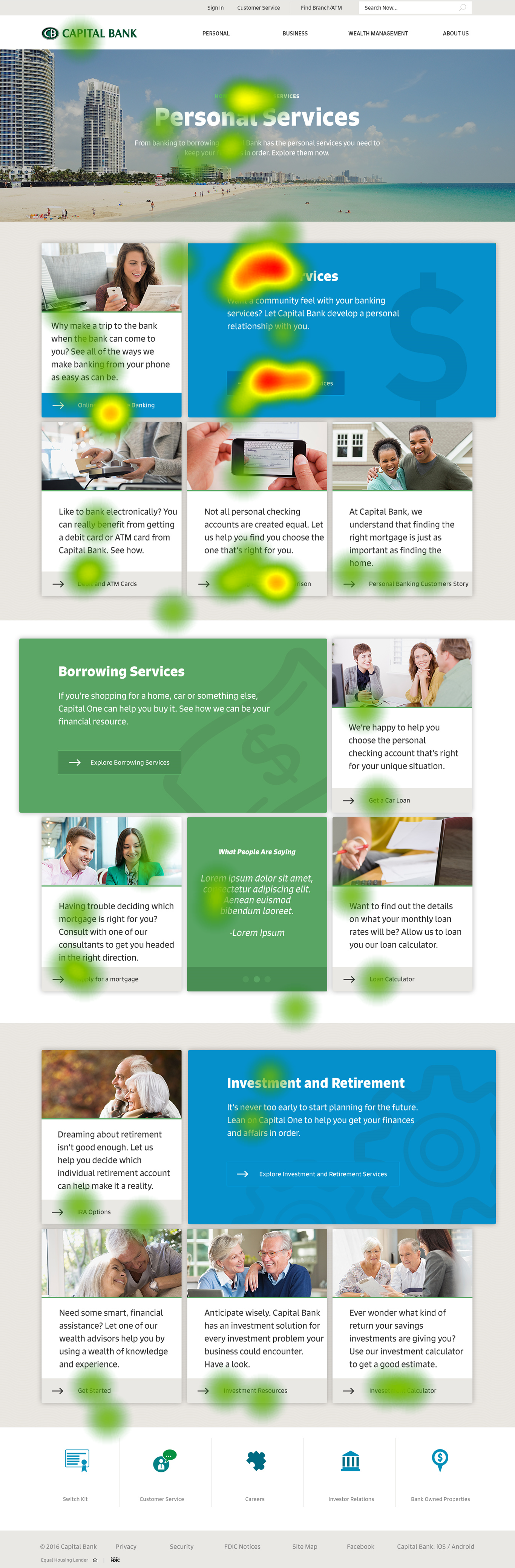
Task two | Homepage
For this task, participants engaged with the card-based system, with the main focus of fixations observed on the main content card within the “Personal Services” card group. There were also fixations on the secondary content cards, particularly on the link at the bottom of each card.
It is important to note that the intensity of fixations decreased as the page length increased. This observation suggested unwanted complexity within the card-based design system.
View the full version of the Homepage heatmap →
Task two | Category page
After engaging with the homepage, participants proceeded to the “Personal Services” page. Their attention focused on the “Banking Services” headline and the button located on the primary content card.
During the study, participants’ visual attention was not limited to the button links associated with the secondary content cards. They also scanned through the entirety of the category page.
View the full version of the Category page heatmap →
Task two | Sub-category page
Once participants selected and navigated to the “Personal Banking Services” page, the “Personal Checking” headline and button attracted a high concentration of visual attention.
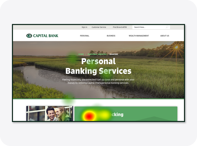
The hierarchy of the sub-category page indicated that participants were able to find the information by linking the headline with the button description. The breadcrumb navigation above the page title showed that the hierarchy of pages was “Home / Personal Services / Banking.”
View the full version of the Sub-Category page heatmap →
Task two | Services page
Once participants reached the “Personal Checking” page, the ‘Request Information’ button drew a high concentration of visual attention. Participants focused their attention on the title and link of each account card.
The breadcrumb navigation above the page title indicated that the hierarchy of pages was ” Home / Personal Services / Banking / Checking.”
View the full version of the Services page heatmap →
Closing thoughts
Users found it easy to search for and find information on the Capital Bank site. To further enhance the site’s ease of use, it would be beneficial to collect data on user flows and use that insight to create focused content paths. A few months after the site went live, Capital Bank merged with First Tennessee to form First Horizon Bank.
Given those circumstances, the project lacked the necessary data to determine the achievement of its three goals and measure the impact of the website design.
To evaluate the success of the first goal—developing a mobile-friendly website offering functionalities relevant to specific user contexts—analysis of mobile user engagement and bounce rate, and assessment of the functionality on mobile devices are necessary.
Tracking the introduction of new technologies and interactions over a specified timeframe could measure the success of the second goal—implementing a design system flexible and scalable enough to adapt to new technologies and methods of interaction.
Finally, tracking average session duration and the number of customer service queries related to website content could assess the third goal—introducing personalized content for the website that enhances user understanding.